Grace Moccia

UX Web Design

Web & App Interface

Prototyping

Product Design

Graphic Design

Print & Digital

I’m Grace— a UX Designer based in Austin, TX

With a B.A. in Psychology and a minor in both Informatics and American Sign Language, I’m especially equipped to tackle UX problems with a nuanced perspective and an academic rigor.

Below you’ll find a catalog of my most recent projects

POW.com

Pow (Place of Work) was created to aid service industry employees with job searches. As these employees are typically younger and less experienced, they tend to be more vulnerable to shady business practices. Pow is a full transparency review site that offers highly personalized job searches with no strings attached. I helped give the concept life by developing an interface that optimizes your job search without a headache.

Major Features:

  • Specialized Job Quiz (Focused on Work Environment)

  • Highly Customizable Search Filters

  • Above-Industry Standard Accessibility

POW.com Homepage

Using a standardized format and navigation, POW is functional and friendly to all. I used high contrast fonts, repeating section formats, and proper heading hierarchy to create a platform as friendly as the workplaces it recommends.

An analysis of the top million websites found that in 2023 only 3.7% of the websites met the criteria from the Web Content Accessibility Guidelines.

This number may seem unimportant, but inaccessibility is one of the main reasons for high bounce rates and ranking lower on search engines like Google. Leveraging accessibility is a great way to boost an SEO and user experience.

POW.com Search

The Modo Stool

The Modo Stool is an expression of powerful functionality designed to be built easily and quickly without hardware, and expected to last a lifetime. Working on this project allowed me to define the design principles that matter most to me, not least of which is focusing on having a wonderful user experience. The Modo stool has a seat size and support that can support all size demographics comfortably while still remaining slight in appearance and light enough to pick up and move around with ease.

Major Feature:

  • Wide Seat

  • Detachable Cushion For Easy Swap

  • Adjustable Stool Height

  • Minimal Hardware Setup

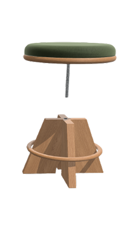
Adjustable/Detachable Seat

The design process for the Modo Stool came after ample research into the UX of chairs/stools as well as understanding the market in terms of affordability, functionality, and ease-of-use. The Modo Stool boasts a wider ideal market of sitters, given that the head of the stool is replaceable with a range of elegant seat cushion options. These options may match any occasion and can provide a tabletop option where the stool can be utilized as a side table.

After sketching out the design, I used Shapr3D to build the product prototype. This included incorporating slits in the wood for easy assembly and threading for cushion attachments. From there a CNC machine was utilized to perfectly cut out the requisite parts from my choice of fiberboard. Tolerance was also included in the design to ensure assembly wouldn’t take too much effort.

Accessible design can go a long way to extend market share as well as create return shoppers. The joy and ease in which an elegant stool can be assembled is analogous to the satisfying experience of opening a new Apple product. User Experience and Accessibility are two sides faces of the same coin.

Interactive Shaper Design Here

Modo Stool Shapr3D

Other Noteable 3D Projects

Portafilter

Claw Hammer

Flask

Julie’s Noodles

Julie’s Noodles is a staple in Austin, serving some of the best soup dumplings in town. Updating an established restaurant’s menu comes with a certain amount of reverence for what came before, so I started this project with the intention of taking what worked in the old menu and bringing it to the new.

Major Features:

  • Modernized & Elevated Graphics

  • Accessible Typefont & Spacing

  • Clear Portion Expectations

Original Menu

Mood board for New Menu

Although an outdated menu may serve as a green flag for authentic Chinese cuisine, Julie’s is popular enough for people to know what’s what. I wanted to reflect the authenticity of Julie’s

While modernizing the menu as a whole, I wanted to maintain the traditional Chinese aspects in the menu. The border elements reinforce this authenticity, and a Chinese lantern was designed in the style of the Julie’s logo to tie the more modern and more traditional concepts together.

Following a similar flow as the original, I formatted all the restaurant’s food items in the same order but now all on one page.

By separating the Mandarin menu from the English menu I was able to create an engaging format with images of what to expect in each food group i.e. noodles, dumplings.

Final English Menu

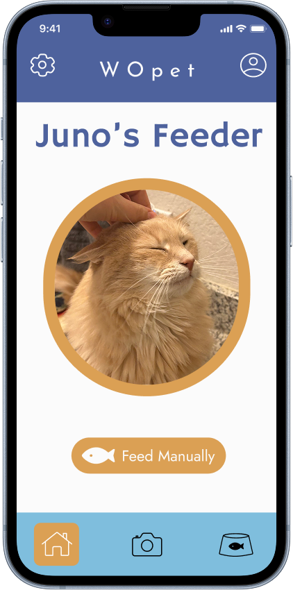
WOpet

WOpet is an automated pet feeder company. The WOpet app connects to the products and allows users to set feeding times for their pets and access the camera on the feeder. I redesigned WOpet’s app with the ultimate aim of creating intuitive navigation and function. Less important but possibly more fun, I wanted to design the new version to reflect the inherent fun and joy of pets. Opening your pet-camera on the app only to see your cat way to close to the camera is an inherent silliness that I think the app should reflect.

Major Feature:

  • Reorganized to Prioritize Users’ Main Goals

  • Increased Accessibility

  • More Enjoyable Graphics

Original WOpet App

User concerns addressed:

After Conducting user interviews, it was revealed that some of the main concerns with the app were the following pain-points:

  • A lack of trust in the app

  • Bad contrast

  • Hard to use

  • Bad interface

  • Lack of personalization

What Changed?

The WOpet redesign offers a more personalized experience, allowing users to customize the image on their home screen. The interface feels more trustworthy and allows users to quickly navigate to their priorities (e.g., feeding, camera). Contrast is improved and the flow of the app is more intuitive.

Redesigned WOpet app